
PDF · A4 · 9 KB · Free, no sign-up. For home and classroom use.
Castle colouring page
A three-towered castle with pennants, battlements and a portcullis, drawn small and centred on the sheet.
A castle stands in the middle of the page with a wide band of empty white paper all the way round it, so nothing touches the edge of the sheet on any side. Three towers rise from it: two at the sides, each with a battlemented crown and a cone roof above, and one taller tower in the middle under a cone roof of its own. Each tower flies a plain pennant on a thin pole. Between the side towers runs a battlemented wall with an arched gate under it, and behind the arch a portcullis is drawn as a row of vertical bars with pointed ends. Blocks of stonework are scattered over the towers and the wall.
The stone blocks are the decision that shapes this sheet. They are not a full brick pattern covering every surface — they are a scattering, which leaves most of each tower as open wall between them. That means you can fill every block a slightly different grey and leave the wall white, or colour the wall and leave the blocks white, and both look like stonework. The second is faster and, on a sheet this open, brighter.
The three cone roofs are the largest closed shapes and the natural place for the strongest colour. Because they are identical in construction and different in size, giving all three the same colour makes the castle read as one building; giving them three different colours makes it read as three towers that happen to be joined. Either is a real choice and it is worth making it before the first roof goes down.
The portcullis is the finest work on the page. Its bars are narrow and closely spaced, and a broad tip will bridge two of them at the first touch. A sharp pencil, or simply leaving the bars white and colouring the dark arch behind them, both work — and the second is quicker and gives more contrast, because a white grid against a dark opening is easier to see than a coloured grid against white.
The pennants are three small flags with nothing on them, which makes them the only place on the sheet where a completely free choice has no consequence. They are also small enough to take a colour that would be too loud anywhere else. Colouring all three the same is what makes them read as belonging to one castle rather than to three.
Grey stone with red roofs is the reading the outline invites and it looks right immediately. But a castle drawn as flat shapes takes a fanciful scheme without any trouble: pale blue walls and gold roofs still read as a castle, because the silhouette does the identifying and the colour does not have to help. The wide white margin round the building is worth leaving white in any scheme, since it is what keeps the castle from crowding the page.
Some plain vocabulary is drawn here rather than described. The alternating high and low blocks along the top of a wall are battlements: the raised parts are merlons and the gaps between them are crenels, and defenders stood behind the merlons and shot through the crenels. The grid behind the arch is a portcullis, a gate that dropped straight down in grooves rather than swinging open, which is why it is drawn as vertical bars with points at the bottom.
Print at actual size on plain A4 paper. The portcullis bars and the thin pennant poles are what a smaller print loses first. There is nothing on this sheet that demands heavy paper unless markers are involved, and if they are, the three cone roofs are where the ink will pool. Cut out along the outer silhouette and the castle comes away with its battlements as a sawtooth top edge, which makes a good standing shape if it is glued to a folded strip.
Before you print
- Colour the scattered stone blocks and leave the wall white, or the reverse; both read as stonework.
- Give all three cone roofs one colour if you want the castle to read as a single building.
- Leave the portcullis bars white and colour the arch behind them instead of filling each bar.
- Use one colour for all three pennants so they belong to the same castle.
- Leave the white margin around the building alone; it is what keeps the castle off the edge of the sheet.
Published Updated 649 words
More in this section
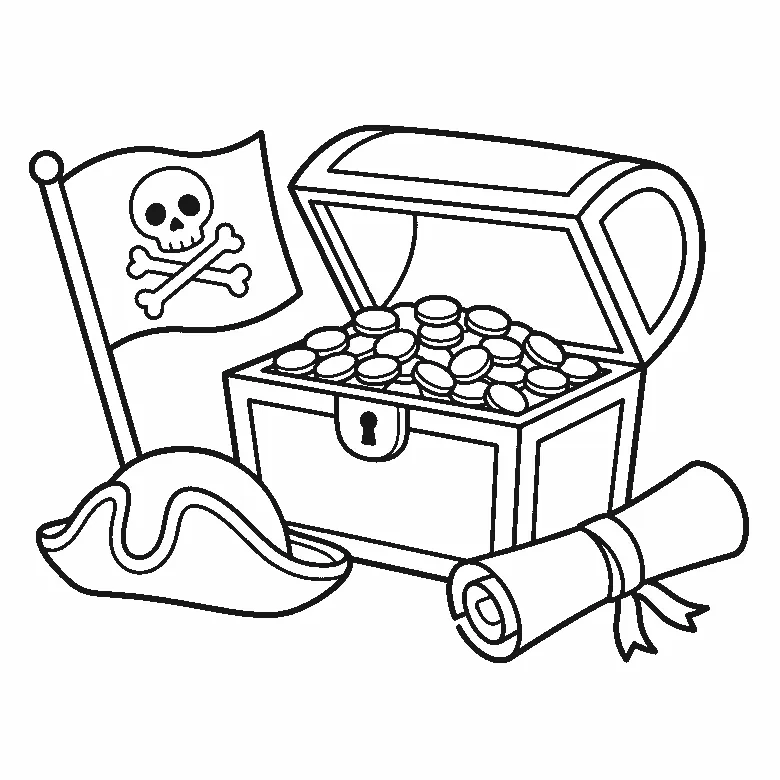
Pirate colouring page
A treasure chest heaped with plain coins, a skull flag, a tricorn hat and a blank rolled map on one sheet.
Colouring outline drawn by us.
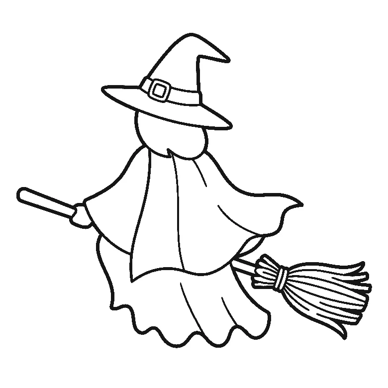
Witch colouring page
A witch seen entirely from behind on a broomstick, with no face drawn at all and a long scalloped cloak.
Colouring outline drawn by us.
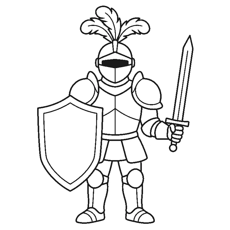
Knight colouring page
A knight in plate armour with the visor closed, a plain shield in one arm and a raised sword in the other.
Colouring outline drawn by us.

Robot colouring page
A boxy robot standing front on, built from rectangles and circles, with pincer hands and an aerial, free as an A4 PDF.
Colouring outline drawn by us.
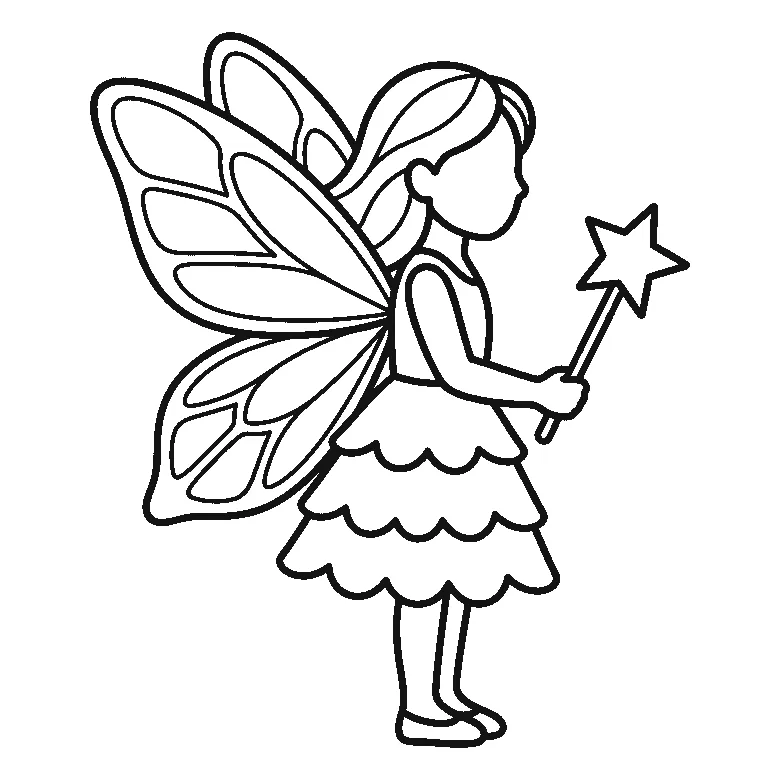
Fairy colouring page
A fairy standing in profile with a blank face, two large butterfly wings and a star-tipped wand, free as an A4 PDF.
Colouring outline drawn by us.
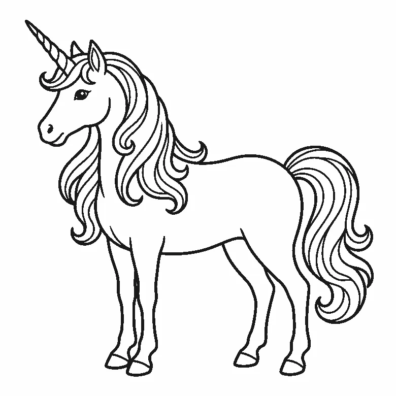
Unicorn colouring page
A standing unicorn in profile with a spiral horn and a long wavy mane, free to print as an A4-size PDF.
Colouring outline drawn by us.
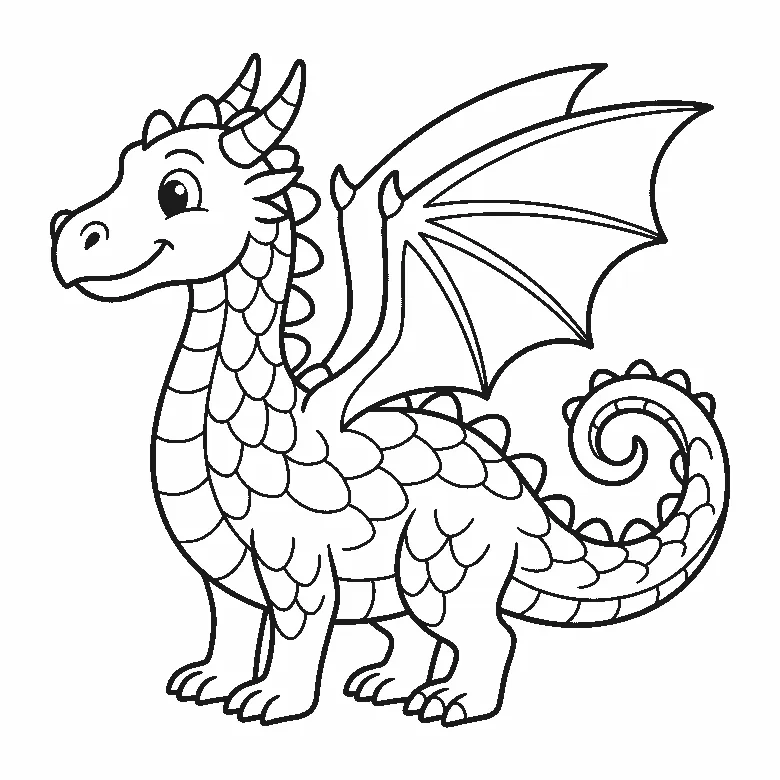
Dragon colouring page
A friendly dragon with two horns, a spiked back and one open wing, drawn in clean black outlines for A4 paper.
Colouring outline drawn by us.
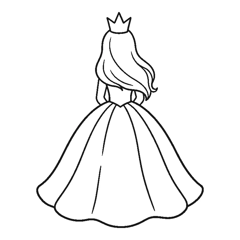
Princess colouring page
A princess seen from behind in a wide ball gown with a small crown, free to print at A4.
Colouring outline drawn by us.
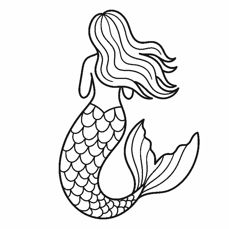
Mermaid colouring page
A mermaid seen from behind with a long scaled tail curling to a wide fin, free to print on A4.
Colouring outline drawn by us.


